Common book cover mistakes
Visual clutter, low typography contrast and genre-clashing fonts all drastically reduce an indie book's click-through rate on digital marketplaces. Authors can fix these issues by selecting a single focal point, adding dark gradient backdrops behind text, enforcing a two-font limit, and testing layouts at mobile thumbnail sizes.
We have all heard the old adage: never judge a book by its cover. The brutal truth of modern indie publishing is that every single reader does exactly that!
Before a prospective reader reads your opening hook or checks your star rating, your cover art has already made a definitive promise about your prose. If that visual promise looks cheap or confusing, readers are very likely to bounce.
I learned this the hard way on my first web serial (this was way before I joined Quibble). I knew my story had potential, but barely anyone clicked on it after I launched it. Why? Turns out that on a smartphone screen, my protagonist looked like a dark smudge floating in gray soup...
Big thanks to the fellow author who pointed this out to me. If you see another author struggling with the same, please be kind and tell them. Reciprocity goes a long way.
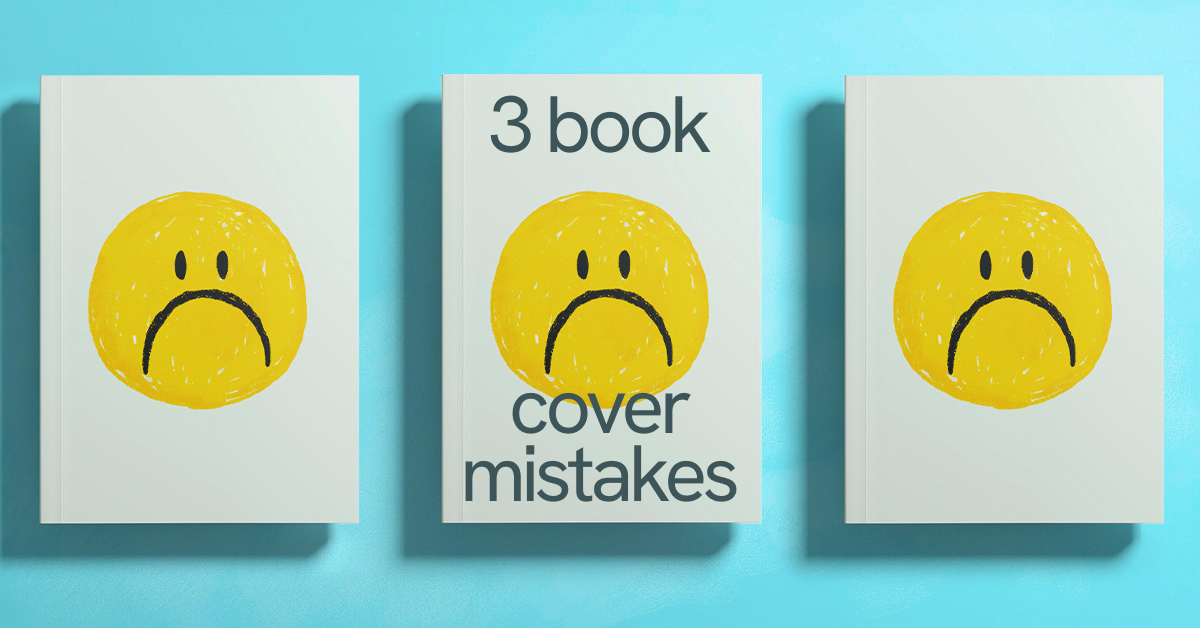
Common Book Cover Mistakes
We see this on Quibble all the time too, which is why we sometimes delay publishing a book before the author “fixes” their cover. Yes, you might not be able to publish on Quibble unless you drop the four competing decorative fonts.
On digital platforms, your cover is your top-of-funnel marketing. When it looks weird, you know what else readers will naturally assume.
I hope the article below will help you avoid the most common mistakes. For a comprehensive look at the other traps to avoid when launching your story on Quibble, check out out this blog post.
1. Crowding Too Much Story
The most frequent blunder indie authors make is trying to treat a cover like a full plot summary. You love your world, and you want to showcase every detail. I know that enthusiasm very well, but trying to fit your protagonist, a glowing sword, a pet griffin, a burning castle, and an ancient celestial alignment onto one graphic creates a visual chaos.
At thumbnail size on a smartphone screen, that elaborate battle scene collapses into an unidentifiable blur.
If a reader cannot process what they are looking at in under half a second, they keep scrolling. Almost guaranteed.
To capture attention in a fast-scrolling feed, you need to simply select a single compelling element that anchors the mood of your story, and let it dominate the canvas. For example:
➤ Character-driven stories: Focus on a clean, high-contrast portrait of your protagonist.
➤ Sci-Fi & Space Opera: Feature a massive cosmic anomaly or a clean starship silhouette against deep space.
➤ LitRPG & Progression Fantasy: Highlight a single iconic class symbol or glowing artifact.
Give your artwork breathing room so the viewer's brain has time to register your concept.
2. Low Contrast Typography and Unreadable Titles
Among all the visual traps indie authors fall into, low text contrast is arguably the most heartbreaking of all book cover mistakes because it is so easy to prevent.
If a reader has to strain their eyes for even a fraction of a second to read your title or author name, you may have lost them. Human brains prefer to avoid cognitive friction. If your text doesn't pop, it simply ceases to exist to a passing reader.
Why does this happen if it's so obvious? Usually it happens when an author falls in love with a background illustration and refuses to let typography "disrupt" the artwork. Sound familiar?
I thought my early title typography looked ethereal and moody - well, until I checked it on a phone screen under direct sunlight and realized it was completely unreadable. It only looked fine on a 27-inch monitor.
Creating a visual barrier between your text and background image takes just a few design adjustments:
1. Color Counter-Balance: Place bright, high-value text (gold, white, neon) over dark, saturated backgrounds.
2. Subtle Gradients: Apply a soft, dark gradient layer behind text zones to push background artwork back and pull fonts forward.
3. Drop Shadows: Use clean, subtle drop shadows to give lettering a dist
3. Font Soup and Genre Typography Clashes
What is a "font soup?" Font soup is using one decorative font for the main title, another for the subtitle, a third font for the author name, and perhaps a fourth for a review quote. (Unless you are intentionally aiming for "hostage note chic," which, please don't.)
Equally damaging is choosing a font family that clashes with your genre. For example:
➤ Bubbly rounded fonts belong on contemporary rom-coms, not military sci-fi.
➤ Gritty stencil fonts signal post-apocalyptic thrillers, not cozy fantasy.
I'm happy to provide more examples if you're interested. We really want you to avoid the classic book cover mistakes.
How to Spot Book Cover Mistakes Before You Launch
Before uploading your cover to any web serial platform, run it through a quick reality check - the Mobile Thumbnail Test:
Shrink your cover design down to 100 x 150 pixels on your phone screen. Hold it at arm's length.
➤ Can you read the title in under two seconds without squinting?
➤ Is the main focal point instantly recognizable?
➤ Does it hold its own next to top-trending titles in your subgenre?
If the answer to any of those questions is no, simplify the background, boost text contrast, or strip away extra fonts before you launch.
Quick Book Cover Fix Checklist
➤ Declutter: Focus on one central image instead of crowding five elements into one frame.
➤ Brighten: Pop your text off the background using strong color contrast, gradients, and drop shadows.
➤ Streamline: Limit your typography to two font families maximum to maintain a professional hierarchy.
➤ Format: Always optimize your design specifically for small mobile thumbnails, not full-screen desktop views.
Need help with cover art? We can warmly recommend our trusted partners at bookcoverhub.com for professional, high-converting designs. Alternatively, you can collaborate with the many incredible artists right inside the Quibble community by joining our Discord Server or posting a request on our official Subreddit.